Two palettes, three typefaces, and a rule about numbers
I wrote a few weeks ago about the front end I didn’t buy — 42 hand-rolled components, no component library. That post was about the stack. This one is about the part I’d been avoiding: what the thing actually looks like.
Until this month, Domi wore Tailwind’s defaults. Indigo accent, cool grey borders, black on white. The web app had drifted to a sage green at some point; the phone was still indigo. Two apps, two brands, and I hadn’t noticed because I was looking at features.
So I asked a design agent to fix it, and the first thing it did was tell me the brand was arguing for the wrong product.
Why there are two
Domi is meant to feel like a private office for the person who runs a household — someone carrying renewals, inspections, insurance and appointments for a whole family. Warm cream and a soft sage is the visual grammar of a wellness app. It reads as friendly. It does not read as discreet, and discretion is most of the promise.
But a household is not one person. The principal wants a private office. Their partner, opening the app to check the calendar, wants somewhere pleasant. Those are different rooms, and I didn’t want to pick one and lose the other.
So there are two palette families, each with a full light and a full dark. Cabinet is the default — ink, ivory, and a single antique-brass accent. Foyer is the alternate — warm paper and a deep forest green. You choose one in Settings on the web and it follows you to the phone.
Two axes, not one list. Theme and mode are separate questions, and collapsing them into “Cabinet dark / Cabinet light / Foyer dark / Foyer light” would make adding a third palette a migration instead of a row.
The colours
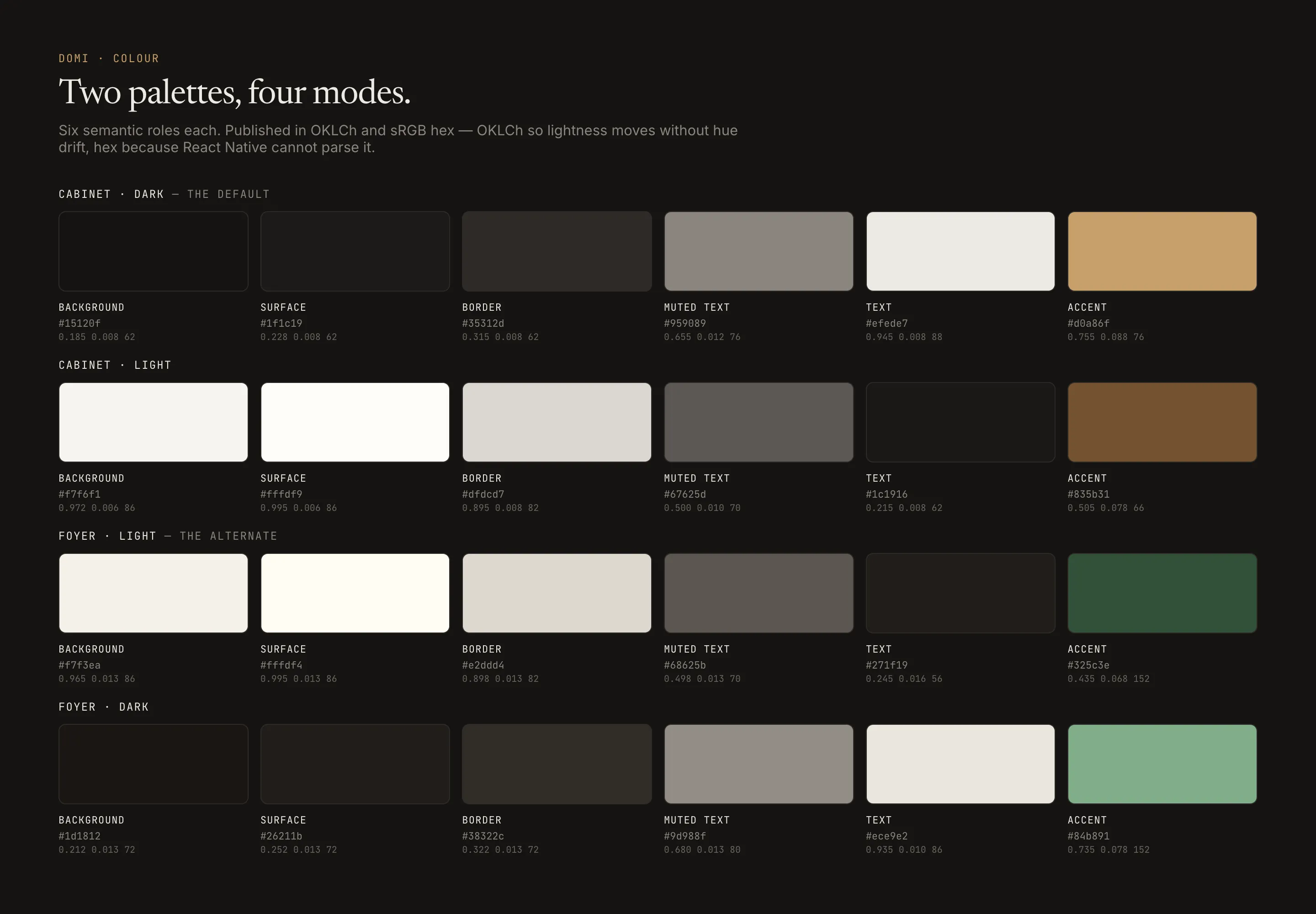
Six semantic roles per palette. Every value is published in OKLCh and sRGB hex: OKLCh because it lets you move lightness without the hue drifting — which is how the hover states got built — and hex because React Native can’t parse oklch(), and the phone needs the same colours as the browser.
The accent appears at most twice on any screen. An eyebrow and a primary button is the entire budget. Everything else is ink, paper, and a hairline.
The type
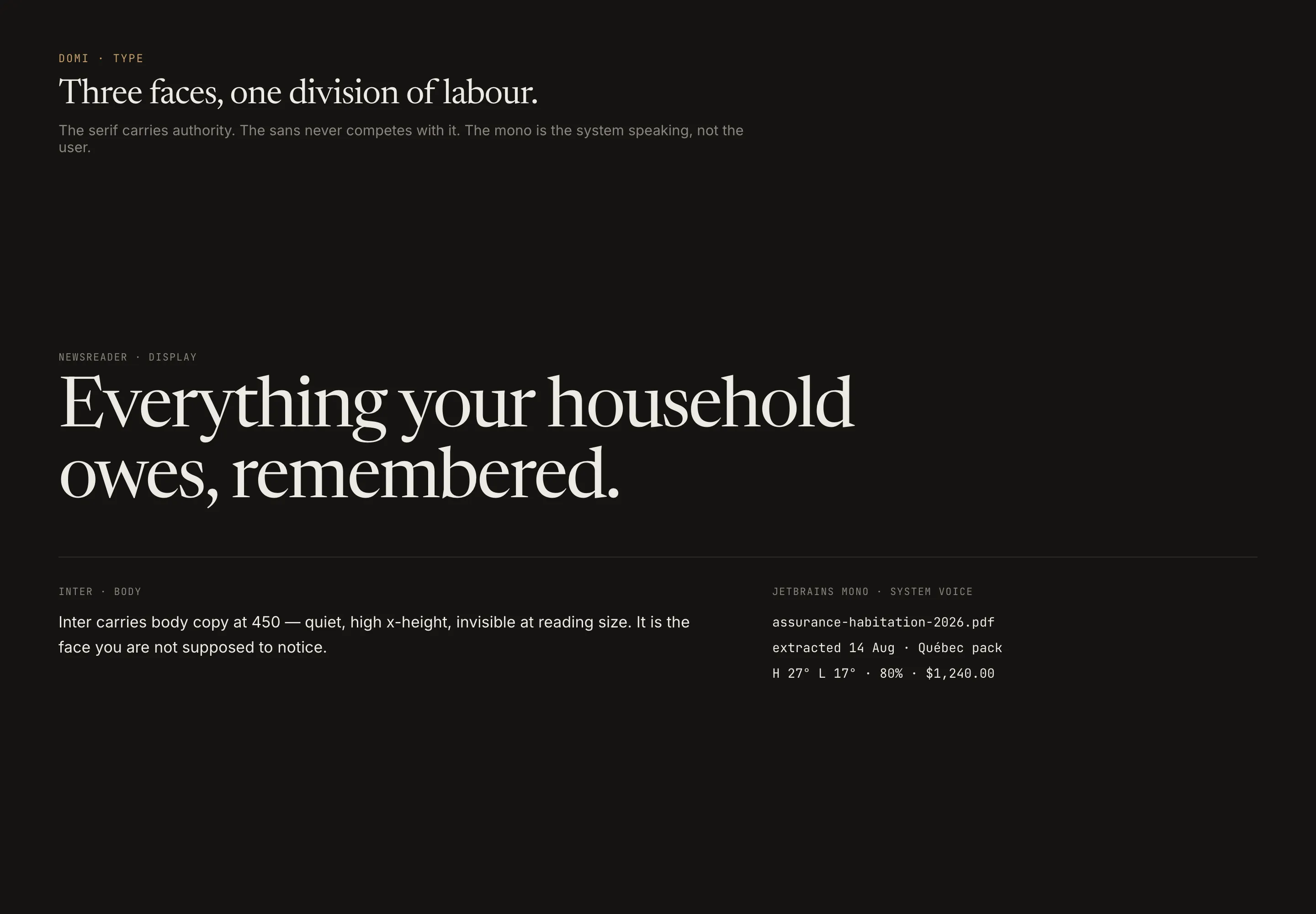
Newsreader for display — screen titles, greetings, the wordmark. Inter for body. JetBrains Mono for anything the system is saying rather than the user: dates, amounts, counts, source filenames, section labels.
That last division produced the rule I’ve quoted most since: one number per screen may be a display moment, and every number that sits in a column stays monospaced. A weather screen’s hero temperature is a display moment — it’s the point of the screen, and it should be set in the serif at 64px. The hourly temperatures underneath it are a column, and columns have to align. Tabular figures, always, for anything you might compare down a page.
There’s a companion rule that came out of a genuine mistake in the spec. It originally said “display face on h1 through h3” and “display never below 18px” — which contradict each other the moment an h3 is 14px, which most of them are. The tag was the wrong abstraction. The face is chosen by role and size, never by which heading level someone happened to reach for.
What it looks like
Same markup. Same components. Only the six token values change.
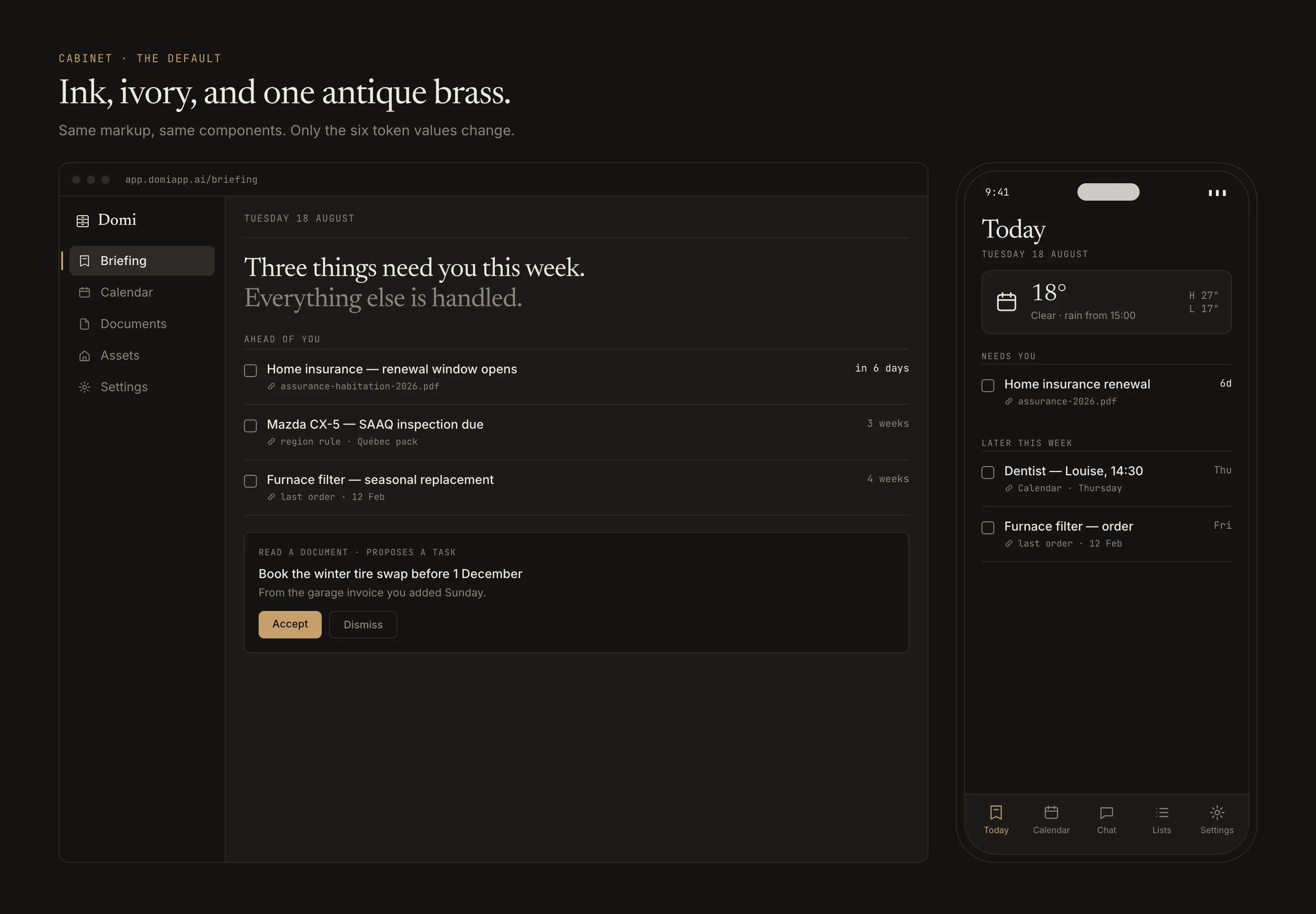
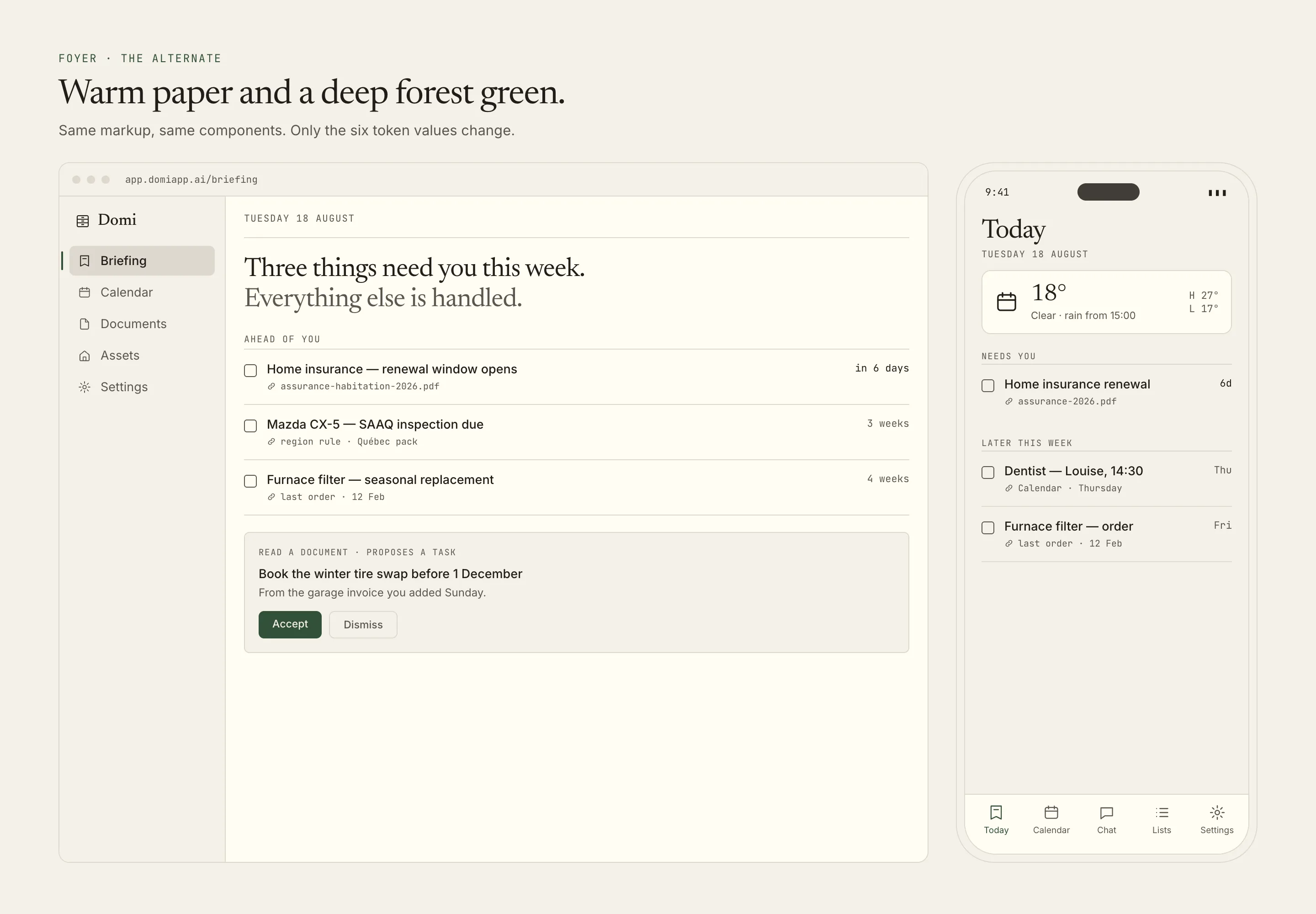
The small monospaced lines under each task are the part I care about most. Domi predicts something and tells you where it got it: a policy PDF you photographed, a rule in the Québec region pack, an order receipt from February. Showing the receipts is more persuasive than any amount of shield iconography, and it has the advantage of being true.
The small rules that carried the most weight
Every hover state raises contrast. Not a preference — a rule. Hover moves lightness away from the background by a fixed step. The failure it prevents is the one everybody ships: text that dims to grey when you point at it, which is backwards.
Never alpha-reduce a text token. This one I learned expensively. The muted-text colour is tuned to sit just above the 4.5:1 accessibility floor, deliberately — a foreground with slack is a foreground wasting contrast. Which means any opacity applied to it drops it under the floor on at least one palette, and it fails silently on that one palette while looking fine on the other three. About 25 accessibility failures traced back to that single habit. There’s a lint rule for it now.
The palette is a JSON contract, not a screenshot. Both apps generate their theme files from the same file, and a test fails if either drifts. The phone and the browser had been hand-keeping the same colour list in two places with a comment politely asking that they be kept in sync — which is the exact defect class this project has spent a month deleting everywhere else.
All 32 contrast pairings were verified before anything shipped. One failed on the first pass — Foyer light’s muted text against its own hover background, at 4.39:1 — and got fixed before it reached a browser. That is the whole argument for computing a palette instead of picking one.
What it cost
A palette swap is not a visual change. It’s a contract change, and the contract was being kept in a few hundred hand-written places.
The phone’s primary buttons ended up at 2.21:1 in dark mode — white text on a light tan background — because the old accent was a dark indigo, so white-on-accent had always been right, and the new palette inverts in dark mode the way warm dark palettes do. Nothing failed. No test broke. I use light mode, so I never saw it.
That’s the honest ending. The system is good; the migration found six defects no test could, and every one of them lived in the gap between “we changed the colours” and “we changed the hundred places that assumed the old ones.”
Domi is in private beta. The design system lives in its own repository now — one JSON file, two apps generating from it, and a decision record that includes the parts I got wrong.